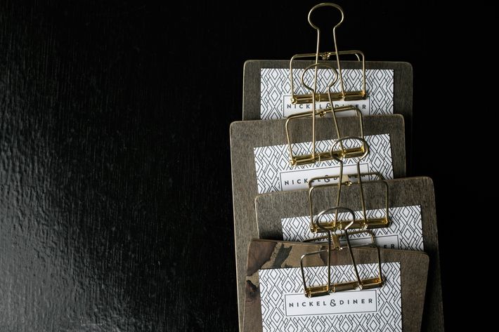
Designing a restaurant is often filled with unexpected challenges — like, say, a brick structure that’s actually filled with hundreds of pounds of steel — but restaurateurs Ivy Tsang and Selwyn Chan knew what they were getting themselves into when they began building out Nickel & Diner, which opened on Howard Street in November. The 100-seat space, inside a nearly century-old pagoda-style building, used to house a $5 Chinese buffet. “You definitely needed a bit of imagination going into it,” Chan says.
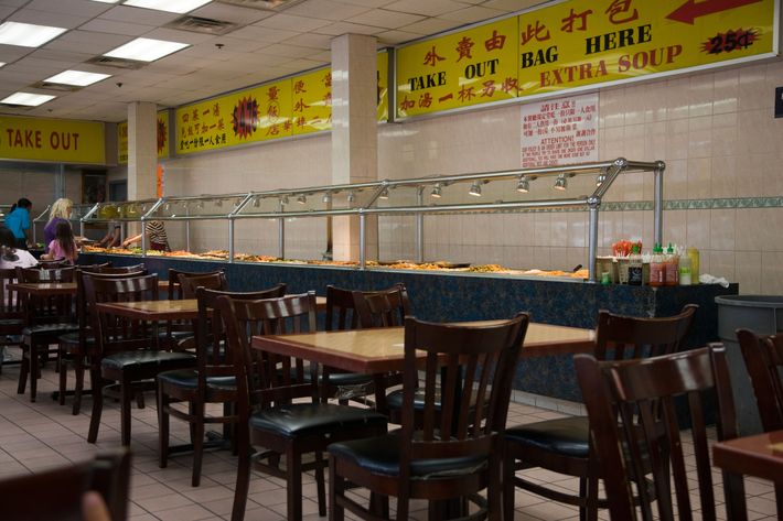
While it’s usually less complicated to transform a pre-existing restaurant because the basic infrastructure is in place, that wasn’t the case here. “Because the space had been so poorly maintained, it was a matter of gutting everything and actually pulling apart a lot of the infrastructure to correct it,” Chan says. “It would almost have been easier to go into a blank space.” To help, Tsang and Chan, who came from the advertising and fashion worlds and also own Chikarashi, first enlisted Andrew Lieberman — a friend and design director for AvroKO to help with the initial layout. Then he referred them to a two-year-old firm founded by AvroKo alums, Dutch East Design. The project took nine months in total.
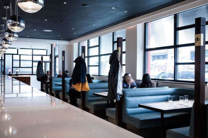
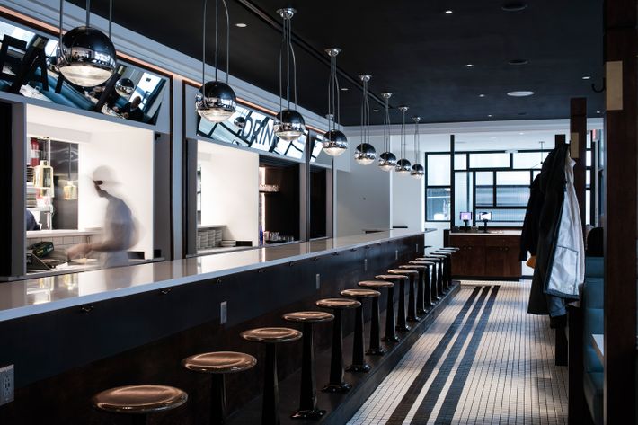
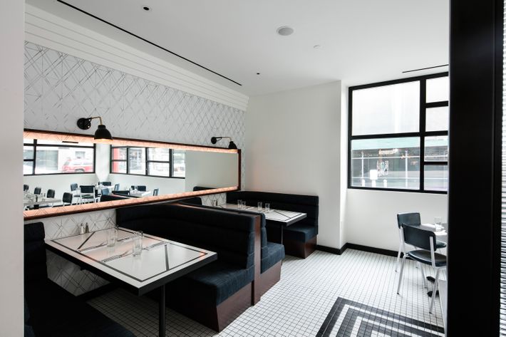
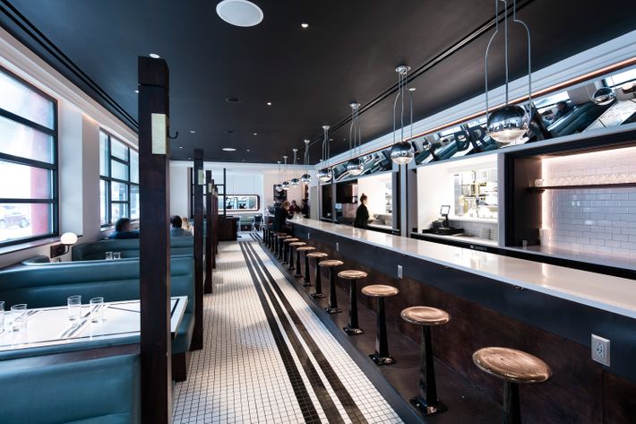
The finished product is a polished, modern space that takes after a pre-1950s-era diner (read: not kitschy), with counter seating and traditional booths in the main space, a separate room with a banquette and tables and chairs in another, and a standalone coffee bar. “We wanted to do something that would fit within the history of the building,” Chan says. “It’a very traditional-looking Chinese pagoda-style building. Streamlined Art Deco sort of goes hand-in-hand with the 1930s Shanghai era of Art Deco. Sometimes, you see spaces that go into a building, and they don’t quite make sense with the overall scope. Individually, it may look beautiful, but it clashes, and we didn’t want to take that approach.”
Shades of blue appear throughout Nickel & Diner — the booths are a striking teal, and as you move through the space, the color deepens. That inspiration actually came from the exterior of the building, where teal appears. “The black-and-white Art Deco lines also help mold together with the building, and that’s how the design first came together,” Tsang says.
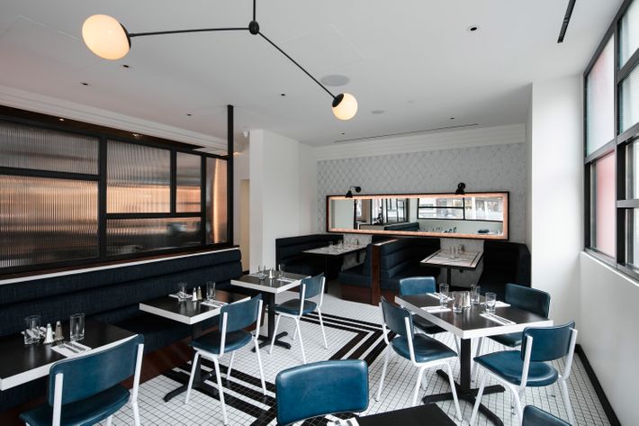
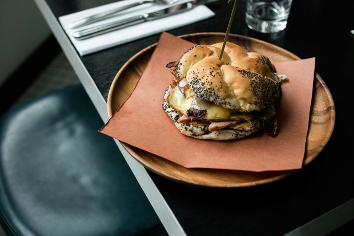
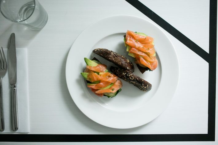
All of these details — plus even tinier ones, like the graphic lines on the tables — make for an extremely photogenic restaurant. That’s no accident, of course. “Nowadays, in order to get your name out there, social media is a big factor,” Tsang says. “In terms of the design, we thought of how people would take pictures. The space itself, when photographed with these Art Deco–inspired lines, looks very sharp.” Take a closer look: